
I’d been hearing about Glide for a while. The promise of turning a simple spreadsheet into a working app, without writing a single line of code, sounded almost too good to be true.
That’s a pretty bold claim, and I wanted to see how well it actually works in practice.
In this Glide App Builder review, I share my hands-on experience building an app with Glide; from signing up to publishing. By the end, you’ll clearly understand what Glide can and can’t do, and whether it’s the right fit for your needs.
What is Glide App Builder?
Glide is a no-code app builder that lets you turn your data into polished business apps without writing a single line of code. Instead of starting from scratch, you connect a spreadsheet like Google Sheets, Excel, or Glide’s own tables, and the platform instantly generates a working app.
From there, you can customize layouts, add components such as forms or charts, and set up automations that eliminate repetitive tasks.
Who is It For?
Glide’s primary appeal lies in its ability to quickly transform data from spreadsheets and databases into polished, functional web and mobile applications.
Here is a breakdown of who Glide is for:
- Entrepreneurs and small teams – Perfect for quickly launching MVPs or internal tools without the cost and delays of traditional development.
- Operations and field teams – Build custom apps to manage inventory, track projects, streamline logistics, or give field reps mobile access to data.
- Startups and SMBs – A cost-effective way to replace clunky spreadsheets with professional, scalable apps that grow with the business.
- Agencies and freelancers – Deliver custom apps for clients using Glide’s templates, AI features, and integration options.
Pros and Cons of Glide App Builder
- AI agent assists in building apps
- Wide variety of integrations available
- Built-in conditional styling and filters
- Secure access and authentication options
- Supports team collaboration features
- Clear usage and billing transparency
- Limited offline capabilities
- Advanced features require paid plans
- No native app store publishing
- Some settings are hidden or nested
- AI agent has preview limitations
Glide App Builder Features
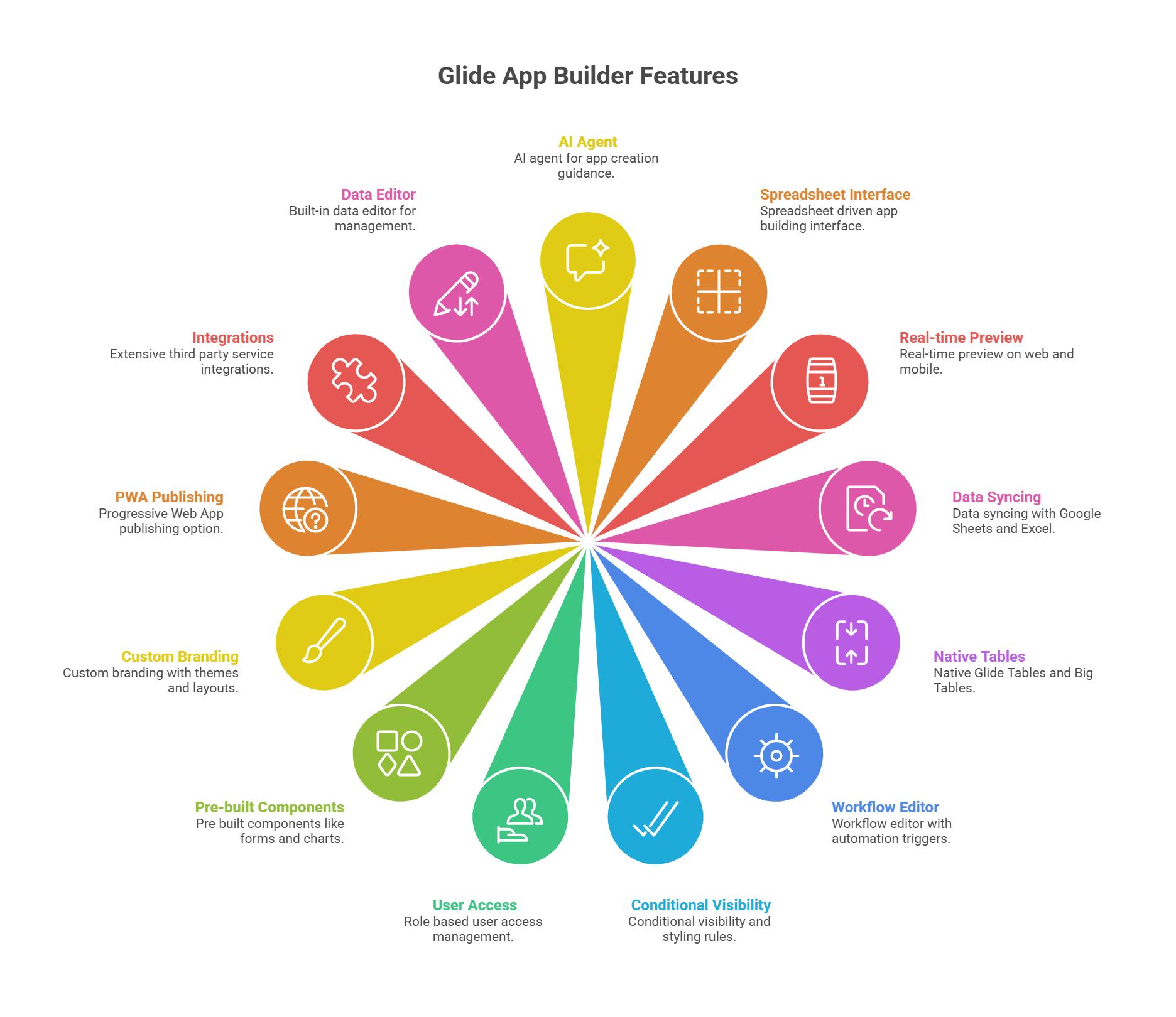
- AI agent for app creation guidance
- Spreadsheet driven app building interface
- Real-time preview on web and mobile
- Data syncing with Google Sheets and Excel
- Native Glide Tables and Big Tables
- Workflow editor with automation triggers
- Conditional visibility and styling rules
- Role based user access management
- Pre built components like forms and charts
- Custom branding with themes and layouts
- Progressive Web App publishing option
- Extensive third party service integrations
- Built-in data editor for management
My Hands-On Experience with Glide AI App Builder: A Step-by-Step Guide
It’s easy to say that a tool solves the greatest human problem. But in some cases, it’s not always as it seems.
To understand how Glide works for beginners and experienced developers, I decided to sign up and put it to a little test.
Let’s see how that turned out.
Getting Started & Signing Up
I started on the homepage at glideapps.com, which greeted me with a bold promise: “Create AI-powered business apps that connect your data and tools, automate manual work, and scale as you grow. No coding required.”
Right away, this gave me two clear options—describe the app I wanted to build or upload a spreadsheet. That immediate invitation to start building felt welcoming.

I clicked ‘Start for free’ in the top-right corner, which took me to the sign-up page. Glide gave me the choice of using Google or just an email. I chose email, entered my email, and clicked the ‘Sign up with Email’ button. No credit card was required.
The spinner confirmed it was processing, and seconds later, I was inside the Glide’s dashboard. This is where I always pause in reviews because the dashboard sets the tone for how easy (or overwhelming) the rest of the experience will be.

On the left sidebar, I saw options like Apps, Members, Usage, Billing, Templates, and Settings, with an Upgrade button at the top. This sidebar made it obvious that Glide is designed for teams, with collaboration and account management built in.
In the main area, my existing apps were displayed as large cards. There was a “New app” card with a big plus sign, which made it easy to start something from scratch, alongside other app cards like Inventory Flow and App. I liked how visual this felt. It reminded me of a project dashboard rather than a technical backend.
Just below, Glide offered an “Introduction to Glide” section with short video tutorials (Getting Started, Data to Layout, The Data Editor, Workflows). This was a smart touch. Instead of forcing me to dig through documentation, Glide surfaced training right where I’d need it.
At the bottom, there was a chat box with the AI agent asking, “What do you want to build?” and even letting me attach a spreadsheet directly. This reinforced the spreadsheet-driven nature of Glide and encouraged me to act quickly.
Overall, my impression of the dashboard was positive. It felt modern, minimal, and business-focused. Unlike some no-code tools that overwhelm you with menus and widgets, Glide kept things simple: start a new app, pick a template, or manage your team. For someone new, this design lowers the barrier to entry significantly.
Building My First App with Glide App Builder
Next, after signing up, I wanted to see how easy, intuitive, and straightforward it is to actually build an app in Glide. So, I went step by step to see how Glide handles the journey from a blank canvas to a working application.
When I landed on my dashboard, I saw a large card labeled “New app” with a plus icon, alongside a couple of automatically generated private apps. I clicked on New app, and Glide opened a modal window asking how I wanted to begin.
The modal gave me two clear choices:
- Start from a template (with options like Basic App, Portal, or Blank).
- Start with data (Google Sheets, Airtable, Excel Online, or databases like PostgreSQL, MySQL, and SQL Server, though the latter were marked as Enterprise).

This was a thoughtful design choice. Beginners can lean on templates, while business users with real data can connect directly to their databases. For me, I wanted to see how much Glide’s AI Agent could do, so I chose the Blank template and clicked Create app.
After a short loading animation (three vertical bars pulsing on the screen), Glide dropped me into the app builder interface.
On the left sidebar, I saw my team name (My Team – Free) and navigation for Apps, Folders, Usage, Templates, and Settings. In the main panel, the phone preview showed a blank green app header with the text: “No screens yet. Create a screen to see it appear here.”

On the right-hand side, the AI Agent chat window opened immediately, welcoming me with: “Hi, ready to build your app in Glide today?” It even provided quick prompts I could click, like “Build a client portal app” or “Import my data.” This was clever. Glide didn’t just dump me in an editor; it nudged me forward with suggestions.
Now came the real test. I typed a detailed instruction into the AI Agent:
“Build me an Inventory Management App using my spreadsheet. Display items with columns: Item Name, Category, Quantity, Reorder Level, Unit Price, Supplier, Location, Last Updated, SKU, Status, and Notes.
Add a dashboard with charts to show total stock value, items low in stock, and stock by category. Create a form for adding and updating items.
Highlight items where Quantity < Reorder Level with a warning. Include filters so users can view inventory by Location, Category, or Supplier. Add role-based access: admins can edit everything, while regular users can only view.
Make the app responsive on desktop and mobile. Add AI to auto-generate notes when stock is low or when an item is trending in demand.”
Immediately, the Agent responded with: “Here’s my plan to build your Inventory Management App in Glide.” It listed out the steps:
- Set branding
- Create the Inventory table with the columns
- Add screens
- Implement filters and access rules
- Enhance with AI-generated notes.
Finally, it asked me: “Do you want to import your spreadsheet, or should I use sample data for now?”
This was impressive. Not only did it understand my long and detailed request, but it also broke it down into a logical sequence of actions, like a project plan.

For the review, I chose “Use sample data for now”. The Agent began “thinking,” and then, one by one, checkmarks appeared next to its steps:
- Update branding
- Create Inventory table
- Create Items screen
How Glide Structures the App Core Features
On the phone preview, the app header switched from green to teal, and a brand-new Inventory screen appeared. It showed a list of items (Smartwatch, Fitness Tracker, Smart TV, etc.), complete with images, categories, and an Add button at the top. A search bar was also automatically included.
The experience was almost magical. The app was being assembled in front of me, field by field.
Next, Glide added a Dashboard tab to the bottom navigation, represented by a chart icon. When I clicked into it, I saw a table view of the inventory—item names, categories, and quantities. It wasn’t a full chart dashboard yet (the AI admitted this needed manual editing), but it was a good starting point.
I also opened the hamburger menu in the top-left of the preview. It listed all my screens—Items, Inventory, Dashboard, User Profile—and even displayed my email at the bottom, showing I was logged in as admin. This gave the app a professional feel right away.

From the Inventory list, I clicked on “Smart TV.” A detailed item page opened showing:
- A large product image.
- Fields for Item Name, Category, SKU, Status, Quantity, Reorder Level, Unit Price, Location, Last Updated.
- Action buttons for Edit Item and Update Stock.

This was impressive. Glide created detailed record views with full editability. The “Low Stock” status was even highlighted in red by default, which gave me confidence that conditional styling rules were working.
Back in the editor, I switched to the Layout tab. From here, I could change how data appeared: List, Table, Cards, Calendar, Kanban, and more. I experimented with Table view, which exposed all my columns in a grid, then flipped back to List view because it looked cleaner on mobile.

Glide also pre-configured filters exactly as I asked. In the Options panel, I saw “Filter by Location, Category, Supplier” already active. When I previewed the app, I could filter inventory in real time—a huge time-saver.
Following the AI’s instructions, I scrolled down in the Layout settings until I found Conditional Styling. Here, I added a rule: “If Quantity < Reorder Level, highlight row in red and add warning icon.” Immediately, my low-stock items stood out in the preview. This small detail made the app feel professional and production-ready.
I then wanted to test the forms. I clicked the Add button on the Inventory screen. A form popped up, already filled with fields from my table: Item Name, Category, Quantity, Unit Price, Supplier, Location, Status, SKU, and Notes.
At the bottom of the form were two simple buttons: Cancel and Submit. On hitting Submit, the item was saved directly back into my Inventory table in real time. This sync worked instantly. The new row appeared in the Data tab without delay.
But Glide also goes beyond just saving. On the right-hand panel, I noticed an “On Submit” section. By default, it’s set to Show notification, but clicking it reveals a whole range of powerful options:
- Workflows for Inventory – trigger an automation, like updating multiple tables.
- Flow – create multi-step processes.
- Data – update, delete, or manipulate rows.
- Interaction – navigate to another screen, show a success page, etc.
- Communication – send an email, Slack message, or SMS when a form is submitted.
- AI – auto-generate text, analyze input, or enrich data before saving.
- Integrations – connect with external services like Stripe, DocuSign, or Zapier.

This really impressed me. Instead of a form being just a way to add rows to a table, Glide turned it into a trigger point for workflows, notifications, and even AI-powered actions.
For example, I could configure it so that when stock levels drop below a threshold, Glide automatically sends a Slack alert or generates a reorder request with AI.
The experience was smooth, intuitive, and professional-looking. I didn’t need to configure every field myself. The system had already mapped them intelligently. But I still had the flexibility to extend the form with conditional logic, styling, and post-submission workflows. For business apps, this combination of ease and power is a huge win.
Switching to the Data tab, I confirmed that Glide had indeed created a spreadsheet-style table with all the columns from my prompt. Ten rows of sample data were preloaded, which made it easy to test. Next to “Inventory,” there was a Users table that already had my email and role marked as “Admin.” That confirmed that role-based permissions were set up by default.

And in the Settings tab, I played with the Appearance options. Changing the accent color instantly updated the phone preview—green, gray, purple—each change was reflected in real time.
I also tested the Sign-in screen, which showed a branded login page with email and Google sign-in options. It looked polished, not like a generic placeholder.
Customizing the Design and Layout
Even without any tweaks from me, the app already looked like something a business could use. That instant starting point removes the blank-canvas anxiety that many no-code tools give you.
Layout Tab
The real fun began when I went into the Layout tab. On the left sidebar, I selected my item collection, and the right panel showed me the available styles: List, Table, Card, Data Grid, Checklist, Calendar, and Kanban.
By default, the app was in List view. Switching to Table view instantly reorganized everything into a spreadsheet-like table with column headers—Item Name, Category, Quantity, and more.
This was perfect for analysis. Then, switching back to List view restored the mobile-friendly browsing style. The real-time updates in the phone preview were seamless. I could see myself using Cards for a customer directory, Kanban for project tasks, and a Calendar view for scheduling—all without touching a line of code.

Conditional Logic for Design
Next, I tested Glide’s conditional logic for design. Under Options, I added a visibility rule to show only items where the reorder level equaled 10. The preview instantly updated, hiding everything else.

A helpful warning also popped up, reminding me that visibility isn’t a security feature. Something I appreciated as it educates beginners about best practices.
Conditional Design Styling Tab
I also explored Conditional Styling, which lives under the Design section. Here, I set a rule: if Quantity < Reorder Level, highlight the row in red and add a warning icon. Immediately, low-stock items stood out in my list. For an inventory app, this is exactly the kind of feature that helps users spot problems at a glance.
Additionally, curious about extending the design, I clicked the + icon next to Components. Glide opened a library organized into categories like Text, Media, Data Entry, Collections, and Special.
Chat Component
I dropped a Chat component into my Inventory screen, and sample messages appeared right away. Later, I removed it with a single click when I realized it wasn’t necessary. This kind of drag-and-drop modularity makes experimenting with layouts frictionless.

Appearance Settings
Then I jumped into the Settings → Appearance menu. This is where Glide centralizes branding. I changed the Accent Color from teal to gray, then to purple. Each time, the phone preview instantly updated the app’s top bar.
I could also switch between Light, Dark, or Auto themes, adjust layouts (top vs. side navigation), and choose content width. While I didn’t have pixel-perfect CSS control, I had more than enough to give the app a polished, branded look within minutes.

Dashboard Settings
Finally, I customized the Dashboard screen separately. Initially, it was a list, but I switched it to Table view to give it a structured, analytical presentation. This ability to style each screen differently—cards in one place, tables in another—is crucial for business apps where each workflow has unique visual needs.
Compared to coding by hand, yes, you sacrifice ultimate control over fonts, spacing, and animations. But the trade-off is speed. Within minutes, I was able to transform the default AI-generated design into something that looked branded, structured, and business-ready.
How Glide AI App Builder Handles Errors
From my hands-on testing, Glide’s AI Agent did an excellent job of avoiding outright errors during app generation, but it did surface important limitations and warnings, which I found just as valuable.
Here’s what I discovered:
After I gave Glide a detailed prompt to build an inventory app, the Agent quickly spun up tables, screens, and sample data. Everything worked smoothly, but it also told me:
This was Glide being transparent. Instead of silently skipping features, it clearly explained what it couldn’t finish and pointed me toward manual edits. That honesty is refreshing, especially for beginners who might otherwise feel confused.
Later, when I tested conditional visibility in the Layout tab, Glide stopped me with a pop-up warning:
“Visibility is not a security feature and should not be used to hide private features or sensitive information.”
This forced me to acknowledge the message before continuing. For someone new to building apps, this kind of guardrail is invaluable. Many people confuse “hidden” with “secure,” and Glide proactively prevents that mistake.
It’s not an error per se, but it’s preventive debugging built into the UI. A smart move that shows the platform cares about real-world usage.

Beyond my recording, Glide has deeper debugging tools when workflows misfire:
- Workflow Run History – Every automation keeps a record. Errors are flagged with a red triangle, and you can click through to see which step failed.
- Step-by-Step Debugger – Lets you replay a workflow visually and see exactly where it breaks (e.g., a text string being inserted into a number column).
- Error Notifications – Glide can send email alerts when a workflow fails, giving you context without needing to hunt through logs.
- Try-Catch Blocks – Just like coding, you can wrap parts of workflows in error handlers. If something fails, you can log it, retry, or send an alternative action instead of breaking the whole process.
This is an advanced feature that puts Glide closer to pro-code debugging than most no-code competitors.
Glide also handles sync issues gracefully. If you connect to Google Sheets or Excel, it recommends static headers and stable data structures to avoid breaking changes. If something goes wrong, errors are flagged visually, not hidden.
Glide’s approach to errors is a blend of prevention, transparency, and recovery.
- For beginners, the AI Agent and guardrail pop-ups prevent common mistakes before they happen.
- For power users, the workflow debugger, run history, and try-catch handling offer the depth needed to run mission-critical apps.
Compared to debugging in traditional coding (stack traces, logs, and breakpoints), Glide’s system is visual, accessible, and actionable. It doesn’t give you 100% raw control, but it gives you confidence that errors won’t derail your app, and if something does go wrong, you’ll know where, why, and how to fix it.
Publishing the App and Adding Integrations
Finally, I wanted to see how Glide handles publishing and integrations—two things that separate a fun prototype from a tool you can actually put in people’s hands.
After wrapping up my “Inventory Flow” app, I clicked the Publish button in the top-right corner of the editor.
- A side panel slid out with the title “Customize your link and publish.”
- At the top, I saw my app icon (a purple box) and its name, Inventory Flow.
- Just below was a field showing the default subdomain: inventory-flow-j9ic.glide.page. I could change the subdomain prefix to anything more branded, like inventory-demo or mywarehouseapp.
- A bright turquoise Publish button sat right in the middle.
- Beneath it, Glide reassured me: “Your app will be private to your users table.” Next to it was a “Change” link in case I wanted to adjust privacy settings before going live.

This step felt smooth and professional. Glide gives you a working subdomain instantly, which is perfect for quick deployment. Having the app default to private is also a thoughtful safeguard. You don’t accidentally expose data before you’re ready.
After I hit Publish, the panel updated with several tabs: Share, Privacy, Publishing, and Domain.
- Share Tab – A large QR code popped up alongside my app’s public URL. There were buttons for copying the link, inviting users by email (with magic sign-in links), and even generating private invite links. This meant I could roll the app out selectively before opening it up more widely.
- Privacy Tab – Glide defaults to Private apps, but you can switch to Public if you want anyone with the link to get in. More granular options included:
- Restricting access to users in your Users table.
- Allowing only certain email domains (e.g., @company.com).
- Enabling Single Sign-On (SSO), which is labeled “Enterprise.”
- Publishing Tab – Showed my app was already live. There was also a toggle to switch to manual publishing, meaning changes wouldn’t go live until I pushed them. This is a great feature for teams who want staging vs production behavior.
- Domain Tab – Listed my current free glide.page subdomain but also gave me the option to connect a custom domain (like inventory.mycompany.com). This required upgrading to Maker or Business plans.

Publishing is literally one click, and the extra sharing options—QR codes, email invites, private links—make it easy to distribute in different contexts. The privacy controls are strong, especially for internal business tools.
And while Glide apps are Progressive Web Apps (PWAs) (not native iOS/Android store apps), the ability to install them on home screens still gives users a near-native experience.
Once my app was live, I turned to integrations because no app stands alone.
I opened the Settings menu from the top navigation and selected Integrations.
- The panel showed Account Integrations first: Excel and Google Cloud Platform, confirming I could link those to my team.
- Below was a huge Add Integrations section with a search bar and filter options. The list scrolled endlessly: Slack, Stripe, Twilio, Gmail, Make, Zapier, OpenAI, HubSpot, and dozens more. Each came with an Add button, making it dead simple to connect.

I liked how clean and searchable this list was. Many no-code platforms bury integrations in menus, but Glide presents them as a first-class feature.
The integrations covered nearly every corner of business operations:
- AI – Connect to OpenAI, Google Gemini, or Replicate for intelligent text, summaries, or image generation. This makes it easy to add AI features without coding.
- Data Sources – Google Sheets, Excel, Airtable, and Glide Tables as the foundation. For Enterprise users, direct SQL database connections (MySQL, PostgreSQL, SQL Server, Cloud SQL).
- Messaging & Notifications – Slack, Discord, and Twilio for sending automated updates.
- Automation – Make and Zapier stood out because they let Glide connect indirectly to thousands of other tools, extending Glide far beyond its native integrations.
- Payments – Stripe was available out of the box, which is huge for anyone building an internal billing tool or lightweight marketplace.
- Analytics – Google Analytics and Mixpanel for tracking app usage.
- Utilities – Everything from DocuSign for contracts to ZenRows for scraping to PDFMonkey for generating documents.
In essence, beginners can stick with Sheets and Gmail, while advanced teams can integrate Stripe, AI, and databases. It scales nicely without forcing you into complexity too soon.
This balance makes sense. Beginners get plug-and-play integrations, while advanced users still have escape hatches via webhooks. Glide clearly isn’t trying to be a “code playground”—it’s focused on abstracting that away while still leaving doors open for more complex needs.
On the integration side, Glide is packed with possibilities. From basic spreadsheets to advanced AI and payment tools, the breadth of integrations makes it clear that it’s robust enough to power real business workflows.
Glide App Builder Pricing & Plans
Glide keeps its pricing straightforward and flexible, which is exactly what you’d expect from a no-code platform designed to scale with you. The best part? You don’t need to spend a cent to get started.
- Free Plan: This gives you everything you need to experiment: one app, up to ten personal users, 25,000 rows of data, and access to 40+ components. It’s more than enough to learn the ropes, test ideas, or build a simple tool for yourself or your team.
- Explorer Plan: This starts at $19 per month (billed yearly). It bumps your limits to 100 personal users, adds 250 updates, and unlocks workflows, AI support, and integrations. It’s a solid step for side projects or small internal tools.
- Maker Plan: This starts at $49 per month (billed yearly). Here you get three apps, unlimited personal users, 500 updates, Google Sheets syncing, custom domains, and branding. This is where Glide shifts from being a playground to something you can confidently launch to the world.
- Business Plan: This comes in at $199 per month (billed yearly). It supports unlimited apps, 30 business users (with the option to add more for $5 each), and 5,000 updates. You also get access to Airtable, Excel, and the Glide API, which makes it ideal for mission-critical apps.
- Enterprise: Pricing is custom. This tier is all about scale and control: millions of rows, Single Sign-On (SSO), AI consultation, account managers, and priority support.
Glide Website Builder Plans
Note:
- Glide offers a 30-day free trial of the Business plan, so you can try out premium features, unlimited apps, and advanced integrations with no credit card required.
- However, in cases where you opt for a payment plan but later change your mind, there’s a 14-day refund window.
- Payments are flexible. Glide accepts major credit and debit cards, as well as Apple Pay and Google Pay.
Best Alternative to Glide
If publishing native mobile apps or having more design control is a priority, Adalo stands out as a strong alternative.
Glide vs. Adalo Comparison
| Feature | Glide | Adalo |
|---|---|---|
| Ease of Use | Very easy, intuitive, component-based interface | Moderate open canvas with steeper learning curve |
| User Focus | Data-driven PWAs and internal business tools | Entrepreneurs, designers, and teams needing native mobile apps |
| Mobile Apps | Builds PWAs installable via link | Builds native iOS and Android apps for app stores |
| Backend & Data | Google Sheets, Airtable, Excel, Glide Tables | Built-in database plus Xano and Airtable integrations |
| Design Flexibility | Limited pre-made blocks and styling options | High pixel-perfect open canvas control |
| Pricing | Based on personal users’ updates and features | Based on published apps, actions, and editors |
Glide vs. Adalo: Top Pick for Beginners & Experienced Teams
Glide App Builder is the better option for anyone who wants to quickly turn spreadsheet data into functional apps without writing code. It’s especially effective for internal tools, client portals, and lightweight business apps where speed and simplicity matter most.
Adalo, on the other hand, is a smarter pick if your project demands a native mobile app experience. Publishing directly to the Apple App Store and Google Play, sending push notifications, and having complete control over design layouts are areas where Adalo excels.
Final Verdict on Glide App Builder
Based on my experience using Glide, I can confidently say it’s a fantastic tool for anyone who wants to turn spreadsheets into real, working apps without touching code. If you’re an entrepreneur testing ideas, a small business creating internal tools, or a team that needs a polished client portal, Glide makes the process fast, intuitive, and surprisingly powerful.
The AI agent, pre-built components, and real-time preview remove most of the friction that usually comes with app development.
That said, Glide is best suited for Progressive Web Apps. If publishing directly to the Apple App Store or Google Play is a must-have, you’ll need to look elsewhere. But for most business and personal use cases, Glide strikes the right balance between simplicity and capability. I’d recommend it to anyone curious about building apps quickly.
